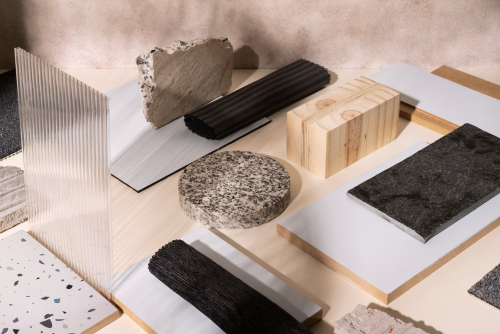
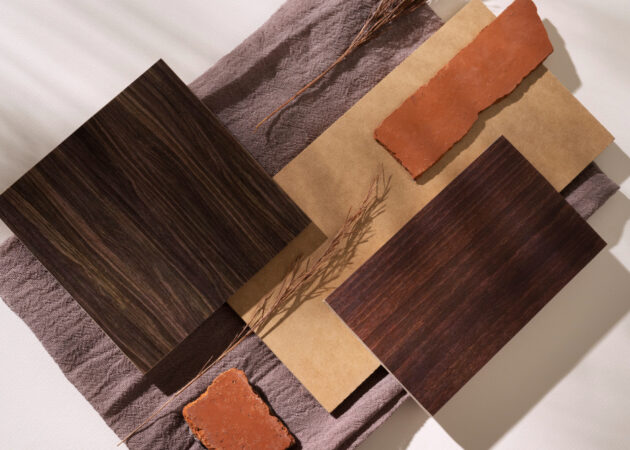
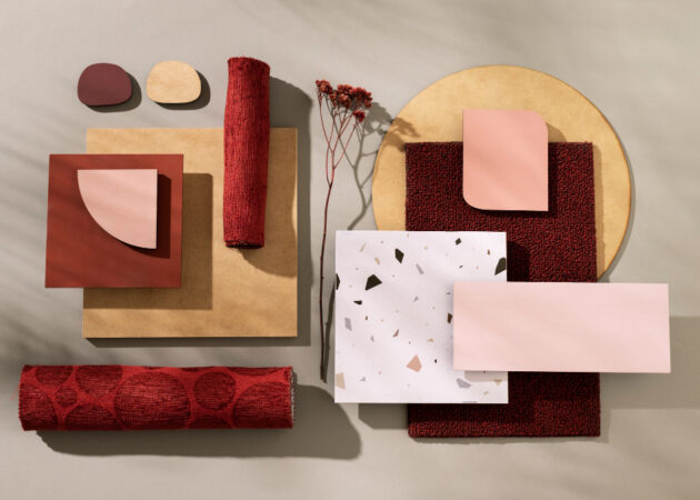
There’s a moment that happens in truly beautiful homes — a quiet exhale the second you walk through the door. Nothing feels loud. Nothing feels forced. The space simply feels right. And more often than not, that feeling comes down to one thoughtful choice: color.
Aesthetic colors aren’t about trends or bold statements. They’re about harmony. They’re the colors that soften a room, invite you in, and make everyday life feel a little more intentional. They don’t shout for attention — they whisper calm.
When chosen well, aesthetic colors have the power to transform a house into a home.
What Are Aesthetic Colors, Really?
Aesthetic colors are tones that feel balanced, soothing, and timeless. They often live in a neutral or earth-inspired family, but they’re never boring. Instead, they’re layered, nuanced, and deeply comforting.
You’ll often see aesthetic colors described as:
Warm neutrals
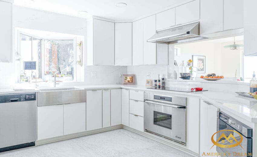
Soft whites
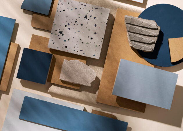
Muted earth tones
Dusty pastels
Gentle grays with warmth
These are colors that age gracefully. They don’t rely on bold contrast or shock value. Instead, they work quietly in the background, allowing light, texture, and life to take center stage — especially in thoughtfully designed home remodeling spaces.
Why Aesthetic Colors Feel So Good to Live With
The beauty of aesthetic colors is that they support your life instead of competing with it.
They:
Reduce visual noise
Reflect natural light beautifully
Create emotional calm
Allow furniture and décor to breathe
Make spaces feel larger and more open
In a world that moves fast and feels overstimulated, aesthetic colors bring us back to something slower, softer, and more grounded — a feeling homeowners often seek during a remodeling project.
The Foundation: Warm Neutrals That Never Fail
Every calm space starts with a neutral foundation — but not just any neutral.
The most successful aesthetic palettes begin with warm neutrals, such as:
Creamy whites
Soft ivories
Warm taupes
Greige (a gentle blend of gray and beige)
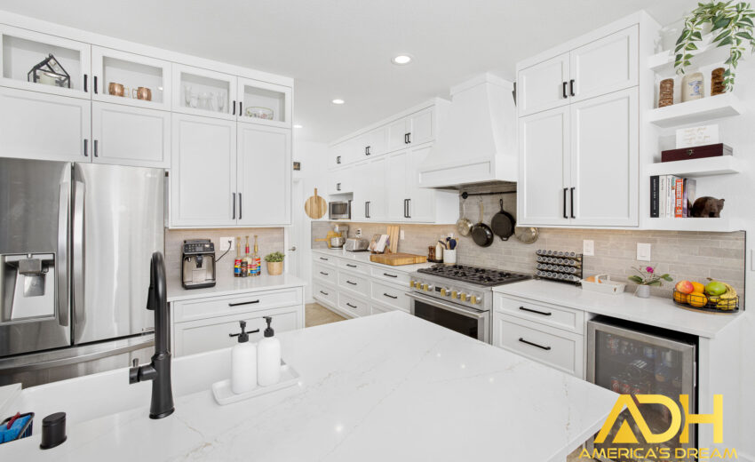
These colors wrap a room in warmth without overwhelming it. They adapt effortlessly to changing light throughout the day and pair beautifully with wood, stone, linen, and natural fibers — especially in refined interior remodels.
A warm neutral wall becomes a canvas — one that lets everything else in the room feel intentional.
Earth Tones: Grounding the Space
Earth-inspired colors are at the heart of aesthetic design. They connect our interiors to the outdoors and bring a sense of rootedness that feels incredibly comforting.
Some of the most loved aesthetic colors include:
Soft clay
Warm sand
Muted olive
Faded terracotta
Mushroom brown
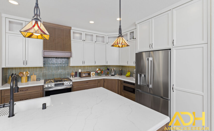
These tones work especially well in living rooms, kitchens, and bedrooms — spaces where you want to linger. They add depth without heaviness and warmth without drama, often complementing natural materials used in kitchen remodeling projects.
Earth tones remind us that beauty doesn’t need to be loud to be powerful.
Check Our Recent Projects
Soft Pastels, Done the Right Way
Pastels can absolutely be aesthetic — when they’re muted and intentional.
Think:
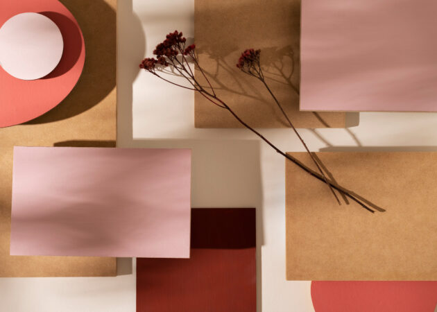
Dusty blush instead of pink
Pale sage instead of green
Powdery blue instead of bright sky blue
Lavender with gray undertones
These softer pastels bring personality while still feeling calm. They’re perfect for bathrooms, bedrooms, nurseries, or accent spaces — especially in spa-inspired bathroom remodels where tranquility matters.
When layered with warm neutrals, soft pastels feel timeless rather than trendy.
How Aesthetic Colors Transform Each Room
Living Rooms
In living spaces, aesthetic colors create a backdrop that encourages connection and rest. Warm neutrals paired with soft earth tones make the room feel inviting and grounded — a place people naturally gather.
Kitchens
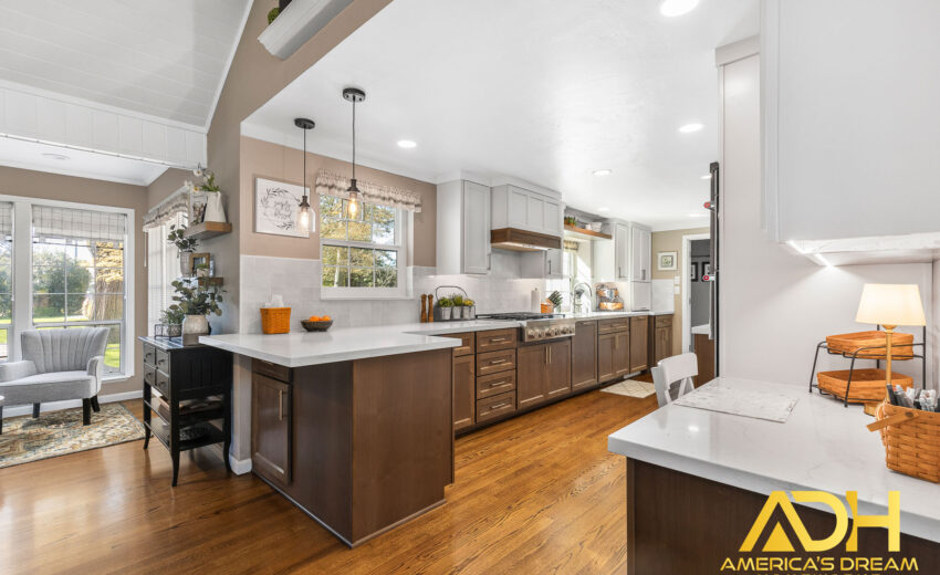
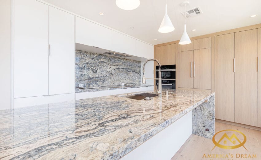
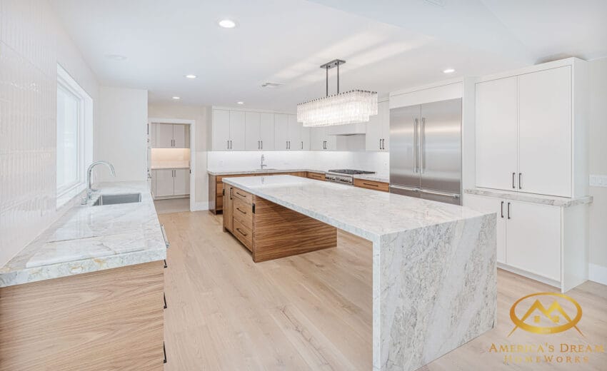
In kitchens, aesthetic colors shine through cabinetry, backsplashes, and wall tones. Soft whites, warm greiges, and subtle greens make kitchens feel clean yet welcoming — never sterile. These palettes pair beautifully with natural stone and wood elements found in many kitchen renovation designs.
Bedrooms
Bedrooms benefit the most from aesthetic colors. Muted tones calm the mind and soften the edges of the day. Here, color becomes part of your nightly ritual of rest.
Bathrooms
Bathrooms take on a spa-like quality when aesthetic colors are used. Soft stone tones, warm whites, and gentle contrast create spaces that feel restorative instead of rushed — a hallmark of thoughtfully executed bathroom remodeling.
Texture Matters Just as Much as Color
One of the secrets to making aesthetic colors truly sing is texture.
The same color feels completely different when layered across:
Natural wood
Linen fabrics
Stone surfaces
Matte finishes
Soft plaster walls
Texture adds dimension, preventing neutral palettes from feeling flat. It’s how simple colors become rich and layered — and why aesthetic interiors always feel thoughtful rather than plain.
Choosing Aesthetic Colors That Last
When selecting colors, ask yourself:
Will this feel calm five years from now?
Does it work in both natural and artificial light?
Does it complement the materials in my home?
Does it support how I want the room to feel?
Aesthetic colors are less about following trends and more about choosing tones that support your lifestyle — a philosophy we apply across every home remodeling project.
The most beautiful homes aren’t chasing what’s next — they’re rooted in what feels right.
Bringing It All Together
Aesthetic colors don’t demand attention. They earn it quietly.
They allow your home to feel layered, lived-in, and deeply personal. They give space for memories, for mornings that start slowly, for evenings that feel peaceful. They’re the backdrop to real life — not a performance.
When you design with aesthetic colors, you’re not just choosing paint. You’re choosing a mood, a rhythm, and a sense of belonging.
At America’s Dream HomeWorks, we help homeowners bring these calm, beautiful palettes to life — whether through thoughtful remodels, material selection, or full transformations. Explore real spaces in our Inspiration Projects or visit our Showroom to experience materials and finishes in person.
Because the most meaningful spaces aren’t just seen… they’re felt.
And that feeling starts with color.
